Atrouli Chatterjee
One of the most important aspects of science is effectively communicating your ideas and findings. In general, there are a variety of venues in which scientific communication can occur, including casual discussions within a teamworking on a specific project, presentations at group or lab meetings, talks at conferences and teaching a class or a discussion section. Here, I will focus on presenting at conferences.
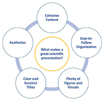
Since COVID-19 increased the number of virtual and hybrid events, the ways in which you can present your work at conferences have grown. Now, the more traditional oral or poster presentations can be given in person, over a hybrid or virtual platform, or asynchronously. Although each conference and presentation style may require a slightly different format and length, all successful presentations have five key things in common.
Cohesive content
As scientists and researchers, you may be tempted to put every piece of data you have ever collected for a project into your talk or poster. Don’t. People want to hear a story, so ask the questions you can answer and guide the audience through your data in a way that is both logical and meaningful.
You can of course talk about any challenges you have faced or areas you are still investigating, but keep the focus on your accomplishments.
You can of course talk about any challenges you have faced or areas you are still investigating, but keep the focus on your accomplishments. Typically, all presentations should start by briefly introducing the topic and providing background; pose an unanswered question in the field; share data that address the question; and finally discuss limitations of the work and directions for future research.
Easy-to-follow organization
For any format of presentation, each slide (of a PowerPoint) or panel (of a poster) should cover just one or two key points. Any more points, and your audience is lost. When presenting in English, your first point should come on the left and your second point on the right. This helps the audience follow along as they read your slides or poster.
Moreover, avoid falling into the trap of presenting your work chronologically. While it may make sense to you, chronological stories of a project tend to have many branching points reflecting the multiple approaches you may have taken, which could be confusing for others who are not as familiar with the content of your talk as you are.
In short, keep it simple and help your audience concentrate on your key points so that they can absorb what you are sharing.
For presentations in a hybrid or asynchronous format, effectively utilizing animations can be helpful. For example, using a simple “appear” or “disappear” function can help focus your audience on specific parts of your talk. In short, keep it simple and help your audience concentrate on your key points so that they can absorb what you are sharing.
Plenty of figures and visuals
Try to have a visual on every slide for a presentation and at least three key figures in any poster. For presentations, the visual should complement what you are saying and be easy to decipher. Make sure to describe the figure during your speech, and for graphs or data, explain what you would expect and how your data compare to your hypotheses.
For posters, figures should be eye-catching. This means they have to be large enough that someone can see them from about 3 feet away and be relatively easy to understand and explain.
Clear and succinct titles
Titles are perhaps the most important component of a presentation. Titles should be different on each slide or poster section. They should be simple and to the point, while also providing sufficient information to convey the main message of your slide or section.
Often the best way to come up with a title is to write a one-sentence summary of your slide or section and then cut out extra words until you are left with the main message. Ideally, if you run through the titles in your presentation or poster, you should end up with a summary of your entire talk.
Aesthetics
Once the content is ready, it is time to carefully evaluate the aesthetics of your presentation. This includes picking a color scheme for your figures as well as background and font colors. In general, your figures should have a cohesive color scheme, and parameters that appear multiple times should be color-coded consistently throughout your talk to help the audience more easily understand the point you are making.
As for the background and font colors, typically having a light background with a dark font color is the easiest to see regardless of the lighting in a room. However, if many of your images have a dark background, it may be more aesthetically pleasing to use a dark background with light text.
Finally, I would like to leave you with advice I received from an advisor regarding presentations. They said, if two high school students, one who could only hear you speak and one who could only see your presentation, sat through your talk, they should both come away with the same information. If you can do that, then you are all set to give a great talk!

